Outlining the location of data in Matplotlib

Right now I’m working on a project involving a set of stars, and I very often plot various quantities as a function of two important dimensions (specifically the stars’ surface gravity log g and effective temperature T, which produces something similar to an H-R diagram). Each star is at a fixed location in those two dimensions, so no matter which particular quantity I’m plotting, the landscape of the plot is the same—dwarf stars along the bottom, giant stars in the top-right, the Sun near the bottom-center, and black marking regions of parameter-space that don’t include any stars at all. Over time the outline of this data set—where stars are and where they aren’t—becomes very familiar.

One of many stellar quantities that can be plotted in these two dimensions.

At other times I’m plotting something else but on the same two axes (maybe a different data set, or a fitted function, or something else). Since I’m so familiar with the outline of my main data set, it’s helpful to know where that data lies relative to this other data I’m plotting. Sure, I could just use the tick labels on the axes, but it’s more effective and allows for quicker orientation to draw an outline of the main data set in this other plot, like so:

A different data set is plotted, with the location of the main data set outlined so the viewer (i.e. me) can quickly become oriented.

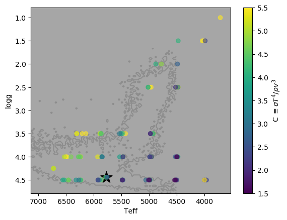
Here’s the code I’m using to produce this outline. The idea is to produce a 2D histogram of the data set and then make a contour plot of that histogram, drawing a single contour at the 0.5 level so that it separates regions that do have data points from those that don’t. Histogram values greater than 1 are clamped to 1 to ensure the contour line sits consistently at the boundary between histogram bins. (I’ve been using this function for quite a while and honestly can’t remember if I put it together myself or found it on Stack Overflow, so please send me a link if you know of an original source!)

import numpy as np
import matplotlib.pyplot as plt

def outline_data(x, y, **kwargs):
    """Draws an outline of a set of points.
    
    Accepts two one-dimentional arrays containing the
    x and y coordinates of the data set to be outlined.
    All kwargs are passed to plt.contour"""
    
    H, x_edge, y_edge = np.histogram2d(x, y, bins=100)
    # H needs to be transposed for plt.contour
    H = H.T
    
    # Clamp histogram values to 1
    H[H>1] = 1
    
    # Contour plotting wants the x & y arrays to match the
    # shape of the z array, so work out the middle of each bin
    x_edge = (x_edge[1:] + x_edge[:-1]) / 2
    y_edge = (y_edge[1:] + y_edge[:-1]) / 2
    XX, YY = np.meshgrid(x_edge, y_edge)
    
    # Fill in some default plot args if not given
    if "alpha" not in kwargs:
        kwargs["alpha"] = 0.5
    if "colors" not in kwargs:
        kwargs["colors"] = "black"
    if "color" in kwargs:
        kwargs["colors"] = kwargs["color"]
    
    plt.contour(XX, YY, H, levels=[0.5], **kwargs)

Jupyter Notebooks in WordPress

I’ve tried a few different ways of displaying Jupyter notebooks in a WordPress post. Here they are (written more as notes to myself than a comprehensive, step-by-step guide):

One option is to save the notebook to HTML inside Jupyter, upload it in WordPress (as a media item), and display that page as an iframe using a WP plugin.

Another is to upload to Gist and use their embed script (which seems to work fine when copy/pasted).

Both the above options suffer from excessive horizontal padding which limits display space, in my experience.

A third option is to copy/paste sections and use a syntax-highlighting WP extension to make the code look nice, but this is tedious (and I haven’t found a highlighter that I think looks great).

The nicest-looking option, I think, though the most technically-involved, is to save the notebook as HTML in Jupyter (i.e., File > Download as > HTML), copy the body of the page (save for the outer few <div> tags), and paste it into a WP post. I copied some CSS from this page into the WP “Additional CSS” (with a fix for the .c1 class, which was missing a period in the CSS declaration), which makes the Jupyter HTML render correctly. This is super-hacky, but I haven’t noticed it affecting any WP elements. I tweaked the CSS to keep the In [1] labels from showing, so that the code boxes can be wider:

.input_prompt {
	display: none;
}

By default, the output areas are limited to 300px of height and scroll after that. To display an area in full height, delete the output_stdout class from the surrounding div.

Since Jupyter embeds images as data inside the HTML file, plots come along for the ride automatically (though the text you copy/paste is really long as a result—you can upload the images and update those <img> tags if you want).

The end result looks like this:

In [13]:
dist, _, flow = cv2.EMD(sig1, sig2, cv2.DIST_L2)

print(dist)
print(_)
print(flow)
0.8333333134651184
None
[[0. 1. 1. 0. 0. 0. 0. 0. 0.]
 [0. 0. 0. 0. 0. 0. 0. 0. 0.]
 [0. 0. 0. 0. 0. 0. 0. 0. 0.]
 [0. 0. 0. 2. 0. 0. 0. 0. 0.]
 [0. 0. 0. 0. 0. 0. 0. 0. 0.]
 [0. 0. 0. 0. 0. 0. 0. 0. 0.]
 [0. 0. 0. 0. 0. 0. 0. 0. 0.]
 [0. 0. 0. 0. 0. 0. 0. 0. 0.]
 [0. 0. 0. 0. 0. 0. 0. 2. 0.]]

(Footnote: the post I linked above links to a WP plugin that provides another possibility for embedding notebooks, but just using Gist’s embed script accomplishes the same thing in a similar way—I think that plugin is useful if you don’t want to lock in to Gist hosting.)

Earth Mover’s Distance in Python

I was exploring the Earth mover’s distance and did some head-scratching on the OpenCV v3  implementation in Python. Here’s some code to hopefully reduce head-scratching for others.  (Fun fact, OpenCV’s Python bindings are automatically generated, so Python documentation isn’t guaranteed. While I found a little bit for the OpenCV 2 implementation, I couldn’t find any for the OpenCV 3 version.)

(View this post as a Jupyter notebook.)

Continue reading “Earth Mover’s Distance in Python”

Dates in matplotlib

The other day I needed to make a plot with dates as the x-axis. Matplotlib supports this, but the examples I was finding weren’t quite as complete as I would have liked. So here’s what I put together as an example.

First, imports. Make sure to get the matplotlib.dates module.

In [1]:
import matplotlib.dates as mdates
import matplotlib.pyplot as plt
from datetime import datetime

We’ll want the date values in the form of datetime objects.

Continue reading “Dates in matplotlib”